Home
The Mailjet Blog
Email best practices
10 Black Friday Emails That Almost Made Us Break Out Our Wallet
Email Best Practices
10 Black Friday emails that almost made us break out our wallet
To give you inspiration for future promotional campaigns, we’ve drawn up a list of the ten Black Friday sends which most encouraged us to spend.
PUBLISHED ON
Our bellies are not the only thing bloated post-Thanksgiving. The inbox is overstuffed with Black Friday messages, tempting the user with clickbait subject lines and purse string-loosening calls-to-action (CTAs).
Here we’ve drawn up a list of the ten sends which most encouraged us to spend.
Table of content
Less is more
Extend the spend
The year’s best offer
Show your true colors
Be prepared
The shareability factor
Bring your email to life
Laugh your customer into the checkout
Low risk, high reward
A little less choice, a little more action
Less is more
A picture says a thousand words, so J Crew have let their image do most of the talking. Animals are always hard to say no to, and this, combined with the wordplay makes for a click-worthy message.

The red theme is festive as well as energizing, ideal for triggering a post-holiday spending spree.
Extend the spend
For Miss Selfridge subscribers, it’s Black Friday all week. Instead of directly urging the customer to buy, they use fun, friendly announcements in their subject lines. ‘Omg!’ ‘T.G.I #BlackFriday!’ appeal to their young, female, social media-wise audience.

To go a different route to flash sales, make like them (and John Lewis, Aldi and Jeep) by spreading your holiday promotions over an extended period. Drip-feed your subscriber an offer each day. Create a dedicated hashtag on Twitter and drive more exposure to each email treat with an intriguing tweet. A/B test your email subject lines to find the one which speaks loudest to your user.
The year’s best offer
The New York Times shows its distinctive brand style by turning a normal promotional paragraph into what resembles a colorful news column, with the key actionable phrases being the most eye-catching.
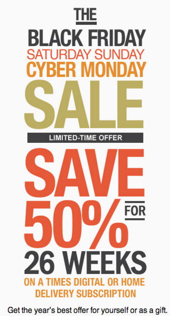
Their bulletproof CTA is also a great tactic in battling for the top of the inbox! Before you look into this though, there are some simple ways to safeguard your email against responsive design issues.
Show your true colors
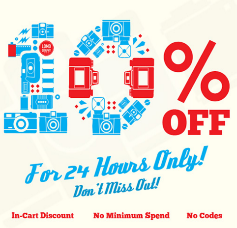
Lomography has stayed true to itself, incorporating images of cameras into its text and using the brand colors - red and blue. Take a leaf out of their book and infuse your brand’s DNA into all of your email marketing.
Be prepared
With deeper discounts and bigger shopping crowds, you have to be ready to tackle any problems that might come your way. Whether it's your website bandwidth or in-store shelves being ransacked, don't fret when something goes wrong. Take a deep breath and use this formula to recover: Humility + Social Proof + Incentive!

Flor gets it just right, apologizing while celebrating the great deal of interest they received and offering a promotion to sweeten the deal.
The shareability factor
Email and social are the perfect partners in crime when it comes to stealing a click from your customer. Integrating the two extends your brand’s reach and drives more exposure to each piece of content used. Modcloth invites subscribers to share their content on social, as well as by sending a gift certificate to their contacts.

Bring your email to life
An easy way to capture a user’s attention is to add movement to your email. Newegg uses an animated GIF of a ticking clock to add some life and emphasize that their offers are time-limited.

If you want to add an interesting visual element, but are having trouble embedding video, using a GIF which links to a video-hosting network can be a handy workaround.
Laugh your customer into the checkout
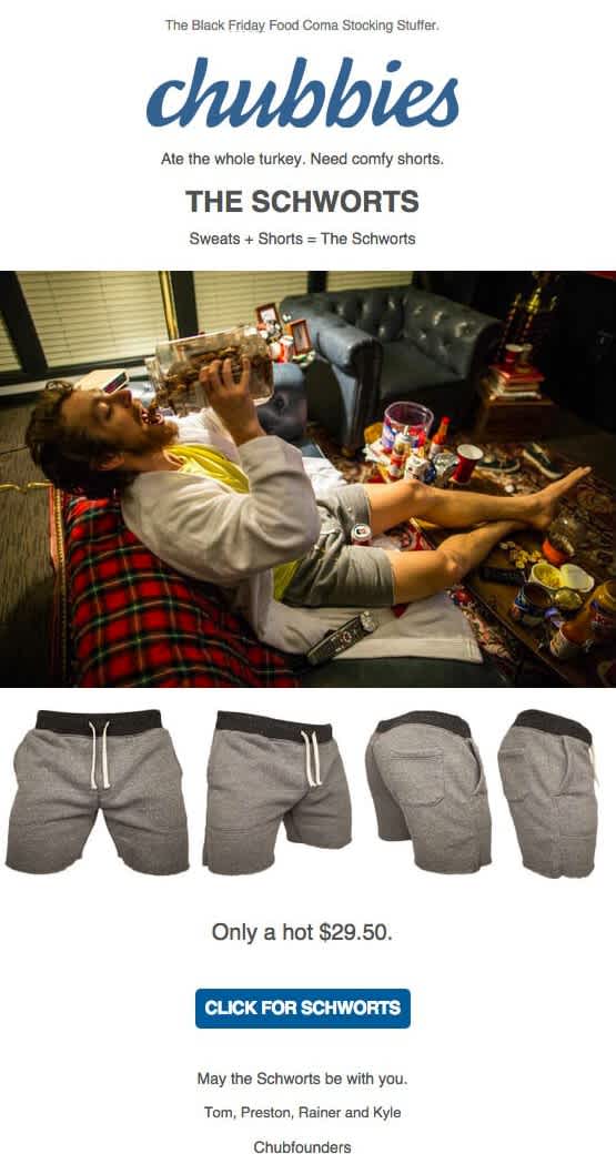
Using humor is a great way to stand out in the Black Friday inbox, whatever your industry. Make like Chubbies and sell your brand’s personality as well as products. Maybe you’ve got a couple of funny subject line ideas and want to find out which to go with. Split test to split your subscribers’ sides.
Low risk, high reward
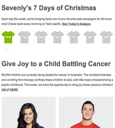
“If it ain’t broke, don’t fix it” the old saying goes. Sevenly recycles their most popular past holiday campaigns, combining this with another low-risk strategy - including a charitable cause. Spending on others makes us happier than spending on ourselves and consumers are primed to give around the holidays.
A little less choice, a little more action
Sometimes too much choice can overwhelm the consumer and actually be bad for business.
Nasty Gal offers a promotion only on black items - narrowing the selection and embracing the Black Friday theme. The succinct, urgent headline gets the subscriber pumped up and primed for impulse-buying. Not the first time a blackout and marketing has worked perfectly together.

Whether you’re running a flash sale or a drip promotional series, use these ingredients to up your email game.
Show a human side with charity and humor. Pick a color scheme which complements your brand but, where appropriate, incorporate red to drive excitement. Use FOMO (Fear of Missing Out)-inducing subject lines and CTAs.
Want even more Black Friday email examples and a free email template? Check out our ultimate guide to Black Friday email marketing.
Summing up
So, all geared up for your next promotional campaign? We can already see your email training montage!
Which of these campaigns do you think packs the most punch? Drop us a comment below!
Want to define your email strategy to win customers over this holiday season? Check out Mailjet's Ultimate Guide To Holiday Emailing.


