Email Best Practices
5 simple ideas to improve your email design
In this post, we tell you about partnering with Siham, 99designs Country Manager France, for five tips on how to improve your email design and campaign.
PUBLISHED ON
We first met with& 99designs(https://www.99designs.fr/) at TNW Europe in Amsterdam (https://speakerdeck.com/elie/10-european-tech-events-that-you-should-attend) and had the chance to attend 99designs CEO Patrick Llewellyn’s workshop about how to take your startup international.
Since then, we’ve been great mates and we welcomed Siham, 99designs Country Manager France at our shared office. What a perfect opportunity to let her share her expertise with our community about how you can use graphic design to make your emailing campaign a real success.
Table of content
Tip 1. Focus on your CTA
Tip 2. Make it easy to read and navigate
Tip 3. Use clear typography
Tip 4. Avoid background images (like absolutely)
Tip 5. Design your email like your homepage

Tip 1. Focus on your CTA
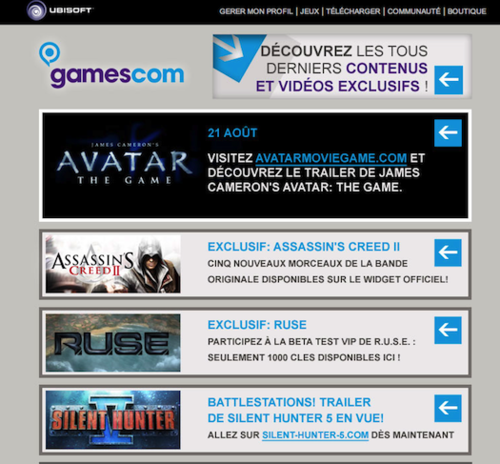
The main goal of your email is to generate visits to your website and make sales out of them. So, you have to use powerfully designed CTA and place them at the right spots. Don’t wait until the end of the email to offer your reader a way out. Display your CTA’s as of the beginning of your email and make sure that they are visible, large and clear from any sort of devices (smartphone, mobile, tablets).
The readers click your ultimate goal and the CTA is the graphic tool you have to make your emailing campaign a success, so place them not once, but multiple times. You can use Mailjet button creator for your newsletter.
(Credits: Gamescom).
Tip 2. Make it easy to read and navigate
Your email should not be wider than 600px. You should be able to scan within a sec all important information. As a result, a good design should not be scrolled from right to left, as it is discouraging, outdated and completely impractical. Studies on eye-tracking have shown that we are much more interested by the information located on the left hand-side of the screen. Use this area with pictures to raise interest and come along with text right to the eye-catching pictures. Once you’ve satisfied the reader’s appetite for imagery, you can make them read.
(Credits : Pinkberry).

Tip 3. Use clear typography
Forget about your favorite font, especially if it is Comic Sans MS, and try to use regular and powerful fonts that are easy to read. If you are not sure about what font you have to pick from the thousand you are offered, stick to the basics: Arial or Helvetica.
On top of that, if you have only boring images on hand to illustrate your text, you’d rather use uber-large fonts to highlight your main message or title.
Tip 4. Avoid background images (like absolutely)
Have you ever opened a blank email? Well, it is pretty much what happens when you use background images as most images are blocked automatically. If your must-read info of the year isn’t readable, it will end up in Trash - or even worst, it can directly end up in your spam box. You should rather use blocks of color to highlight your text.
Tip 5. Design your email like your homepage
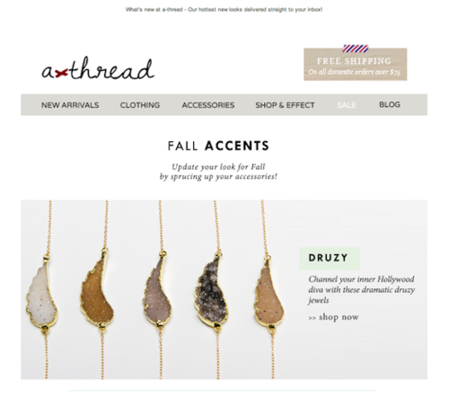
Like your homepage, you only have a couple of seconds to convince. The structure should be clear at first sight, so remove all pointless graphics that disturbs the reading flow. Optimizing space is key, so design your email with a maximum 3 columns and use menus like on your home if you have multiple services/products to present. Your main goal remains unchanged: offer a quick way-out to an optimized landing page to convert.
(Credit: a-thread).
It may not be your birthday, but we’d like to spoil you anyway!
99designs is the largest marketplace for graphic design. If you need to refresh your email designs, we’ve created for you 12 email designs you are free to use for transactional emails, newsletters and notifications. Download them here for free (for the psd files, click here).
If you’d prefer to get a unique and personalised email design or any other graphics of your choice (logo, business card, webdesign…), it is easy and possible with 99designs’ 235 000 designers! Get 25€ off today and 79€ in visibility options by clicking on the Mailjet partner page.
