Email best practices
How to tackle the biggest email design and development challenges
Are you struggling to design and develop the perfect email campaign? The inbox throws a lot of curveballs at email marketers. But if you know what to look for, why it happens, and how to fix common problems, you can overcome these challenges.

PUBLISHED ON
The email channel is an excellent way to achieve major marketing objectives, but for those who design and code campaigns, it also causes frustration.
Why doesn’t this look right in Outlook? How come our logo disappears in dark mode? Why is it so hard to make a mobile-friendly email campaign?
The road to a successful email program is littered with design and development obstacles. Thankfully, you’re not the first person to try and take on these email marketing issues. If you’re using Sinch Mailjet as an email marketing platform, you already have some solutions right under your nose, and you may not have to worry about it. We’ll tell you more.
Ready to stop banging your head against the wall? We’ve identified some of the biggest email design and development challenges and compiled important tips and resources you’ll need.
Table of content
1. Creating responsive email campaigns
2. Fixing inconsistent email client rendering
3. Dealing with dark mode emails
4. Coding HTML emails
5. Addressing email accessibility issues
Where do brands struggle with email design?
The best way to find out about the biggest email design challenges that marketers are facing is to ask. So, we did. More than 3,000 senders from around the world completed the Inbox Insights 2023 survey and answered our questions on their goals, struggles, and processes.
Some of the key takeaways from Inbox Insights 2023 came from a list of top email design and development challenges. We asked respondents to select up to three of their biggest challenges. These five issues topped the chart:
Responsive emails (36.1%)
Inconsistent rendering (35.1%)
Dark mode (24.5%)
Email coding problems (22.8%)
Accessibility issues (22.4%)

Any of those sound familiar? We’re willing to bet at least a couple of these email design challenges resonate with you. Maybe there are others that you didn’t even realize could present problems.
Let’s take a closer look at these five challenges and what you can do to address them.
1. Creating responsive email campaigns
We all use our phones to do just about everything. So, we’re not going to waste time trying to prove to you how important mobile-friendly emails are to your success.
You need your campaigns to look good and function correctly whether subscribers view emails on laptops, tablets, or smartphones. That means your campaign designs need to adapt to different screen sizes. The problem is that many email layouts break when displayed on smaller screens.
A responsive email design adjusts for various screens and devices so that subscribers receive a consistent inbox experience no matter where they view your campaigns.
Quick tips for responsive email design:
Use a simple, single-column layout.
Consider a slightly larger font size for mobile readability.
Make CTA buttons easy to tap (minimum of 44px by 44px).
Optimize images for Retina displays.
Include adequate white space in the email design.
Keep static images under 200kb in size and keep GIFs to less than 1mb.
Part of the challenge behind creating responsive emails stems from the fact that marketers design and develop email campaigns on desktop computers with large screens. So, they start with desktop layouts and try to compensate for smaller screens.
Choosing responsive email templates or using a drag-and-drop email editor that has responsive design built into the platform can really help marketers send more mobile-friendly campaigns.
If you’re coding your own emails, though, responsiveness might be a little more challenging. Experienced developers suggest taking a mobile-first approach to help you overcome responsive email design challenges. Mobile-first email development involves designing and coding for small screens first and then expanding the design for tablets and larger computer screens. A responsive email framework, like MJML, can also make things easier.
Resources that can help:
Get curated mobile email marketing statistics from Jordie van Rijn.
Check out the guide to creating responsive emails from Sinch Mailjet.
Read our article on responsive emails for essential tips and advice.
2. Fixing inconsistent email client rendering
The second biggest challenge for email design and development involves the different ways email clients like Gmail, Outlook, Yahoo Mail, and Apple Mail handle your code and ultimately display your design. These inconsistencies happen because there are no defined standards for rendering emails. Thankfully, the Email Markup Consortium (EMC) is an industry group working to solve that problem.
The challenge of inconsistent rendering is one of the biggest issues in email, but many marketers are still completely unaware of it. They probably realize it’s necessary to test how their campaigns display on mobile versus desktop. However, they may have no idea that Gmail could render an email differently than Apple Mail. Or that Yahoo Mail supports something that Outlook does not.
Examples of email client rendering inconsistencies:
Google fonts will render correctly for subscribers in Apple Mail, but not Gmail.
Animated GIFs work just about everywhere, except desktop versions of Outlook.
Adding interactivity with AMP for Email is supported in Gmail and Yahoo Mail, but not in Apple Mail or Outlook.
A linear gradient will display in Gmail, and Apple Mail, but not in Yahoo Mail and only in some versions of Outlook.
There’s only one way to know how your email campaigns will display on all those clients and devices. You’ve got to test and preview before you send. Some email teams do this manually. They have colleagues check things out on their personal accounts and mobile devices. But that is time consuming and unreliable.
Sinch Mailjet offers Email Previews that automate pre-send testing. You can see how your emails render on all the most popular clients and devices (before you hit send).
Resources that can help:
Visit CanIEmail.com for in-depth details on email client support for CSS and HTML.
Find out how to set up fallbacks for email safe fonts.
Conduct email marketing quality assurance: Discover the best way to QA emails.
Find out why emails look bad in Outlook.
The challenge of inconsistent rendering is one of the biggest issues in email, but many marketers are still completely unaware of it. Email previews can help with testing email rendering across clients before you send.
3. Dealing with dark mode emails
The challenge of developing dark mode emails is also connected to inconsistent client rendering. Email clients handle dark mode in different ways, including varied support for a media query that detects if a recipient is using a light or dark theme.
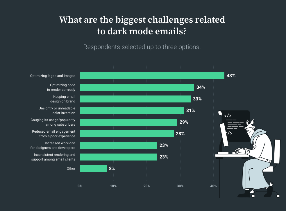
However, there are plenty of other things that can go wrong with dark mode and email design. Back in 2021, we asked marketers to tell us about what challenged them most about dark mode.
The top five dark mode design challenges were:
Optimizing logos and images (43%)
Optimizing code to render correctly (34%)
Keeping email designs on brand (33%)
Unsightly or unreadable color inversion (31%)
Gauging usage/popularity among subscribers (29%)
It looks like dark mode is a digital design trend that’s here to stay. So, take the steps necessary to optimize your emails for those who prefer a darker user interface.
Because dark mode may change things from your original design, testing and previewing is once again the best way to catch issues. Our dark mode for email survey found that around 59% of senders test emails in dark mode before sending.
Maintaining a simple and consistent color palette for email designs makes it easier to address color inversions that sometimes occur when emails are opened in dark mode. Some of the other challenges can be solved quickly, such as adding a slight glow around black logos that disappear into dark backgrounds.
Resources that can help:
Watch: How to Prepare Your Email Design System for Dark Mode (Email Camp 2022 session with Roland Pokornyik).
Get insights on dealing with dark mode development challenges from Sinch Email on Acid.
Discover six ideas to fix dark mode logo problems.
4. Coding HTML emails
Coding emails can be confusing – even for experienced developers. For one thing, there are significant differences between coding websites and emails. What works on your site may not work in your subscribers’ inboxes.
Here are several things to consider:
Email coding often uses tables for layout purposes.
Inline styles are a best practice for CSS in emails.
Only six-digit hex codes for color are universally supported in email.
JavaScript is not supported in email for security reasons.
Even something as simple as formatting bulleted lists in email can be tricky.
For many marketers, coding isn’t their strongest skill to begin with. So, the complexities of email development can be overwhelming. Thankfully, there are plenty of low-code and no-code email building options available. You’ll need to decide what’s right for your program – DIY email development or a drag-and-drop editor? The answer could be a mix of both. If you don’t have the need for a full-time email developer, a no-code, WYSWIG editor can be used by anyone on the marketing team. Then, you can always hire a freelance email developer or agency for more complex email campaign ideas.
A big benefit of using Sinch Mailjet to build emails is that you’ve got options and flexibility. Teams can take advantage of our intuitive Email Editor, which has drag-and-drop functionality and access to a template library. But if you employ developers, they also have the option to code emails from scratch using HTML/CSS or MJML.

Resources that can help:
Dip your toes into the basics with this article on Email Coding 101.
Get started with the Mailjet Markup Language when you check out this MJML tutorial.
Find out more about how to use Mailjet’s editor to get the most out of the platform.
Join the Email Geeks Slack community to talk shop, ask questions, get help, and make connections.
Interested in learning more about email coding and email development? Check out Email on Acid’s Notes from the Dev: Video Edition to get tips and tricks from skilled email developers.
5. Addressing email accessibility issues
Rounding out the top five email design challenges is the issue of accessibility. It’s encouraging to see that email marketers realize they need to work on making HTML emails more accessible. But although awareness is increasing, the problem persists.
A recent report from the EMC found 99.9% of the thousands of email campaigns the group evaluated had serious or critical accessibility issues.
“Accessibility in emails is table stakes. You cannot leave even one person out just because you think they’re not important enough and it won’t make a difference. If email is about communicating, then we should take everyone into account and do our best to support those people.”
Megan Boshuyzen, Sr. Email Developer, Sinch
An inaccessible email will lead to lower overall engagement while alienating certain subscribers. However, when you improve email accessibility, it makes the inbox experience better for everyone – not just people with disabilities.
Quick tips to improve email accessibility:
Choose a legible font with a minimum size of 16 px.
Add alternative (alt) text for all important images in emails.
Use
<h>tags for subheadings to support screen readers and keyboard navigation.Note: Mailjet’s templates are preformatted with
<h>tags and you can easily format your own as you would in any text editor – no coding necessary.Never send image-only emails. Always use live text for key information and calls to action.
Evaluate the color contrast of email designs for accessibility.
Many of the steps above are easy to implement, and they’ll go a long way towards making your emails more accessible. These improvements are a worthy investment. Email accessibility makes it easier for people of all abilities to read, understand, and engage with what you send. That means more clicks and a better email ROI. But addressing accessibility also shows your brand cares about all subscribers’ needs.
Resources that can help:
Watch: Megan Boshuyzen’s email accessibility presentation from Unspam 2022.
Check out Email for All from ActionRocket and Paul Airy to find out how accessibility impacts the inbox experience for email subscribers.
Download our free ebook, Accessibility in the inbox, to learn more about the importance of accessible email campaigns.
Discover a list of the best email accessibility testing tools.
Use the website Accessible-Email.org to get a free evaluation of your email accessibility.
When you improve email accessibility, it makes the inbox experience better for everyone – not just people with disabilities.
Email marketing teamwork and processes
Inbox Insights 2023 found that nearly half of the senders we surveyed say their teams can launch a new email campaign in less than a week. But the size of your team makes a difference.
Results show 70% of one-person email teams can launch a campaign in less than a week while larger organizations definitely tend to take longer. We found similar results when comparing small business email marketers to enterprise email teams. There are certainly benefits to being small.
It’s easier to keep things moving when you’re a one-person email team. But as you get into bigger groups and take on bigger email marketing projects, responsibilities are divided, reviews and approval slow things up, and communication can break down. So how can you stay agile as a business grows and the number of people involved in email marketing does too?
The email production process gets smoother, faster, and more flexible when you introduce an email design system. Think of it as building emails with reusable pieces or blocks, much like you’d put together a Lego set with bricks of different shapes and colors. This system gives you the opportunity to define the ways your team addresses email design challenges. Plus, it makes it easier for designers and developers to follow brand guidelines, which 22% of our survey respondents called a top challenge.
We found that nearly 20% of email teams aren’t using a design system at all while another 38% only use a system some of the time and 5.7% aren’t sure what their email design process is.

Our survey also revealed that 82.5% of email teams that launch an email in less than a week are using an email design system. That includes plenty of one-person email teams, and it shows how having defined processes for email marketing boosts efficiency no matter your size.
Find out how the team from Sinch Email built a component-driven email design system that works with four different brands and multiple languages. You can also watch an Email Camp 2022 session in which Megan Boshuyzen and Avi Goldman of Parcel.io explain why this approach is the future of email creation.
Find tools to tackle email design challenges
You may be the smartest email marketer this side of the equator. But if you’re working with tools and technology that fall short of your needs and expectations, the success of your strategy will suffer. A carpenter with a high-powered nail gun is going to work faster and better than a guy with a rusty hammer.
That’s probably why 19.5% of senders say Insufficient tools are one of their top three email design and development challenges. What’s in your email marketing toolbox? If you need an email service provider (ESP) that goes beyond the basics but is still easy to use, give Sinch Mailjet a try.
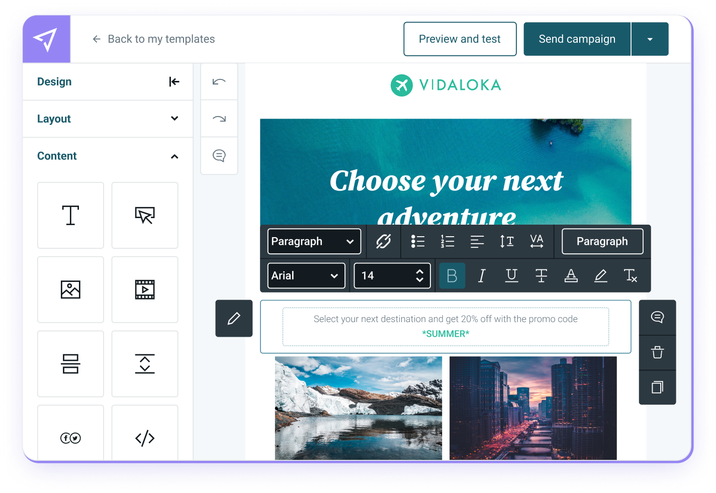
Bring your ideas to life with our versatile Email Editor. It gives you the option of using pre-designed templates, building original campaigns with drag-and-drop functionality, or using your own email code. Play around with our demo to see how it works.
Once you’ve designed and built an email using Sinch Mailjet, you can see how it renders on dozens of clients and devices before you hit send with Email Previews. Plus, use our platform to A/B test email designs and discover what really works.
Get going and start sending with Mailjet for free. Upgrade as you grow.


