Email best practices
10 newsletter signup form examples that drive conversions
Signup form design can make or break your list building strategy. We’ll explore every aspect to consider when building your forms and share some of our favorites.

PUBLISHED ON
No matter how you drive traffic to your website, converting fleeting online visitors to more loyal and potentially profitable email subscribers should be a priority for any online marketer. This process starts with having a great email newsletter signup form to capture new contacts.
Despite this, many marketers let potential subscribers slip through the net by deploying less optimized newsletter signup forms. Or worse still, by hiding their subscription forms behind buttons and links that nobody ever clicks on.
If this sounds like a problem you identify with, it's time to develop your email marketing signup form best practices and create engaging signup forms your website visitors can’t ignore.
Table of content
1. Pure and simple, you have Seth’s permission to join his list
2. Aldi knows its customers love its "middle aisle" surprises
3. Find your tribe and build a community
4. Don't just sell hot air – your subscribers need incentives
5. Offering a little exclusivity
6. The FOMO is very real
7. We care a lot
8. Share a passion, and get people talking
9. Sun, sea, sand, and email marketing inspiration
10. Fight for your subscribers' right to party
What is a newsletter signup form?
An email newsletter signup form is a simple tool for any business or organization to grow its email list and maintain a direct line of communication with its subscribers.
The signup form typically asks for the user's name, email address, and sometimes additional information such as their interests or location. Newsletter signup forms can be found on websites, social media pages, mobile apps, and other digital platforms. Once a user has signed up, they’re automatically subscribed to your email lists to receive regular emails with news, updates, promotions, or additional information related to the topic of the newsletter.
Why do you need a newsletter signup form?
Attracting visitors to your website is an expensive business. Whether you’re investing in SEO-optimized content, paid search campaigns, sponsored social media posts, or a combination of all three, it can be challenging to generate a positive return on your marketing investment. This problem is particularly true when visitors make multiple visits via these costly acquisition channels.
As a retention marketing technology, email marketing is considered a much more cost-effective marketing channel than more expensive acquisition channels. As such, email marketing is the profitable component of everything else you do to promote your business.
A good signup form will help you:
Build your subscriber list: Email list growth is one of the biggest challenges facing email marketers today. You must keep your email list in good shape if you want to continue to send targeted email campaigns and promotions that lead to increased engagement and sales. It's crucial to remember email addresses have a limited shelf life. Therefore it is considered email marketing best practice to constantly build your email list.
Keep your subscribers informed: Once someone has signed up to your email list, they have given you permission to keep them informed about new content, products, or services available on your website. This permission lets you keep subscribers engaged with your business, encourage them to return to your website, and build customer lifetime value (CLV).
Develop relationships and build reputations: By sending regular email campaigns, marketers will develop a relationship with their subscribers. This process will help build trust and loyalty, resulting in repeat business and positive word-of-mouth referrals.
Increase website traffic: Email marketing can also help to drive traffic back to a website. By including links to new content or products in email campaigns, subscribers will be more likely to visit your website to learn more. For example, if you are creating new blog content, an email newsletter is a great way to drive traffic to it.
The importance of growing an email list the right way
Your email marketing newsletter signup form isn’t just about collecting data.
When deployed with a reputable email marketing service provider, your signup form will also help you ensure that your subscribers are collected in compliance with various regulations including GDPR, CASL, CPRA, and CAN-SPAM.
All of these regulations are built on the concept of permission. As such, every email newsletter signup form must include a permission statement to confirm the subscriber has consented to join your list.
The concept of consent is enhanced by allowing subscribers to confirm their subscriptions via the double opt-in process. The double opt-in process requires a subscriber to click on an acceptance link sent to their inbox before joining the list, proving they have given their permission to receive your regular communications.
Once subscribed, your ESP will provide all the tools you need to manage your subscriptions, including the all-important unsubscription link on every subsequent email send.
5 tips to create a great newsletter signup form
Newsletter signup forms are the very first impression of your brand, and it separates the greats from the merely good. A well-designed form will increase your chances of attracting loyal subscribers. So it’s worth investing some time to create something eye-catching.
Here are some fundamentals for creating great forms:
Keep it simple: Your signup form should be short and to the point. First, ask for essential information, such as the subscriber's name and email address, but avoid asking for too much personal information. You might be tempted to ask for details such as company name, job title, or company turnover, but this will make potential subscribers think twice about completing the form. The shorter and simpler the form, the more likely people will be to fill it out.
Offer a compelling call-to-action (CTA): People are more likely to sign up for your newsletter if you offer them something in return. Consider offering your subscribers a free download, discount code, or exclusive content. Make sure to highlight this incentive prominently on the signup form.
Make it stand out: Your email newsletter signup form should be the most visible item on the page. Consider your use of images and colors and position them in a prominent position on every page of your website (not just on the homepage). Never be tempted to hide the signup form behind a button or a link. You can also use pop-ups or slide-ins to make your signup form more visible.
Make it mobile friendly: More than 60% of all website traffic now comes from mobile devices. Therefore, your email newsletter signup forms must be mobile-friendly. Use a responsive design that adjusts to different screen sizes and keep your signup form short and easy to fill out on a small screen.
Test and optimize: Test different versions of your signup form to see what works best. Try different CTAs, placements, images, and colors to see what resonates best with your subscribers. If you can, try to A/B test your signup forms against alternative versions. Monitor the engagement with your analytics tools to track your results and optimize your signup forms accordingly.
Want a step-by-step process for creating high-conversion email newsletters? Then take a look at this detailed guide we’ve just finished putting together.
10 newsletter signup form examples to inspire you
A little creativity goes a long way when embedding your email newsletter signup forms into your website. We’ve compiled 10 examples of email signup forms that really work hard to drive those all-important subscriptions. How could you take these ideas and incorporate them into your own strategy?
1. Pure and simple, you have Seth’s permission to join his list
Seth Godin knows a thing or two about permission-based marketing. He coined the term. So why wouldn't you follow Seth's email marketing best practices? On Seth's Blog, his subscription form sits proudly at the top left-hand corner of every page. It's a straightforward approach, but why complicate things?

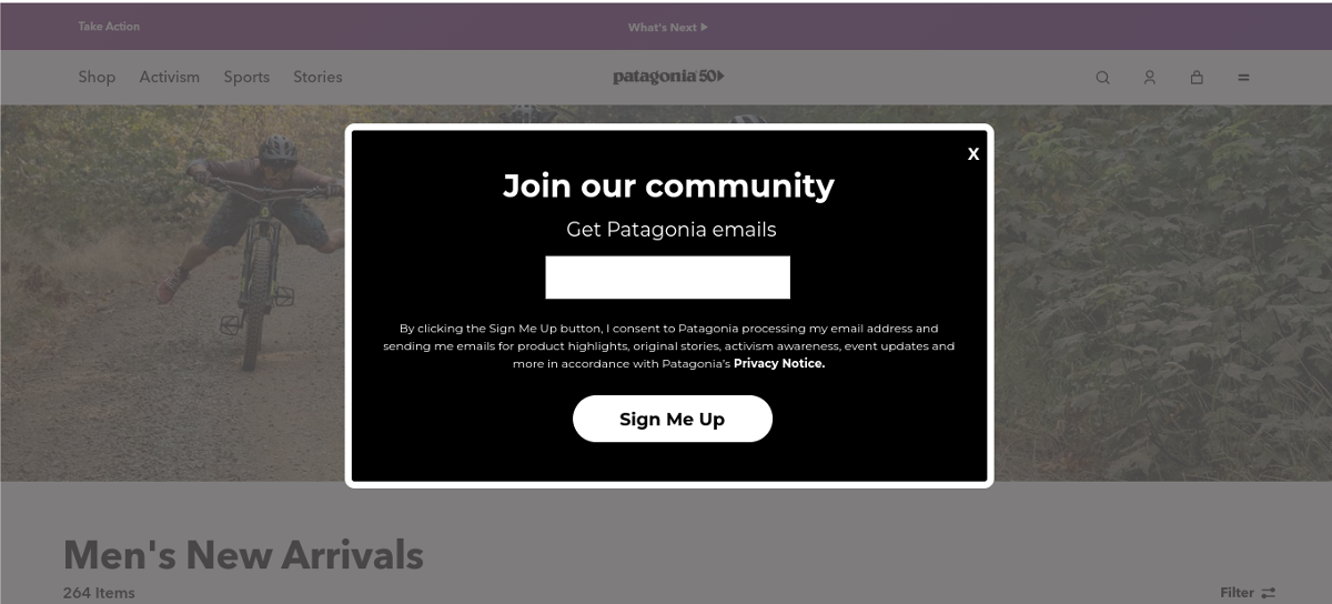
2. Aldi knows its customers love its "middle aisle" surprises
Low-cost supermarket Aldi is famous for its somewhat random middle aisle offers. They know their customers don't like to miss out on these great savings. The store dedicates considerable space on its homepage because it knows its email newsletters drive considering traffic into its stores with these crazy, but too good-to-miss, opportunities. Unwilling to miss a single chance to convert a visitor to a subscriber, the store also embeds a simple one-field subscription form at the bottom of every page of its website.
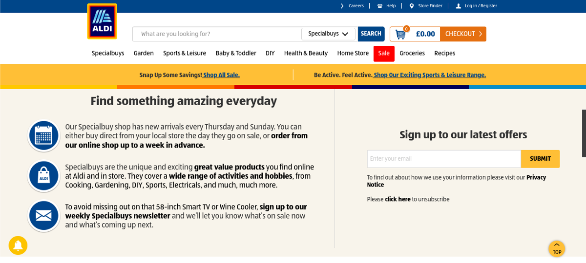
3. Find your tribe and build a community
The outdoor clothing company Patagonia has a reputation for caring about more than just its bottom line. Its customers are passionate about the great outdoors and, as a community, would want to support any organizations that share their values. The keyword here is "community." Patagonia isn't building an email list. They are building a community of like-minded individuals. The fact that the community might buy a product or two is a happy coincidence.
4. Don't just sell hot air – your subscribers need incentives
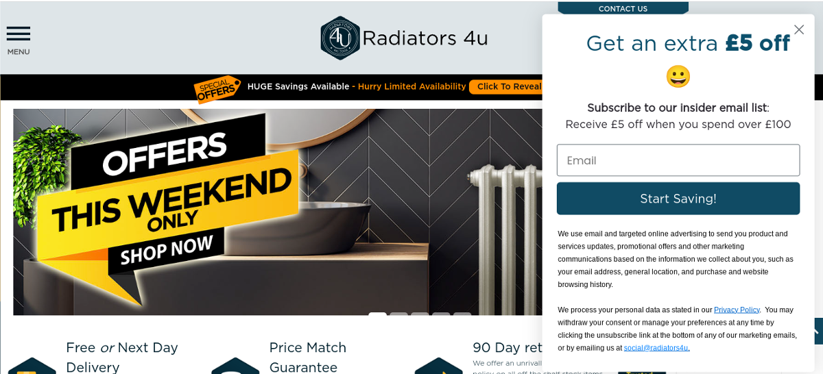
Radiators 4U understands that the customer journey, particularly for a considered purchase like a home heating solution, can be long and convoluted as shoppers visit multiple websites, looking for the best deal. Therefore, offering your potential clients a small incentive to keep them returning to your site as "hot" leads is a great idea to help keep your business "front of mind" in any competitive market.
5. Offering a little exclusivity
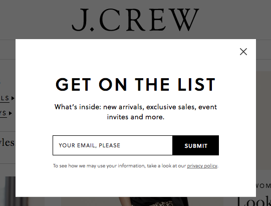
Forget bulk emails. Sometimes your subscribers want to feel like they are a member of an exclusive club. J.Crew's email campaigns are obviously very exclusive, and if your name is not on the list, you're not getting in.
6. The FOMO is very real
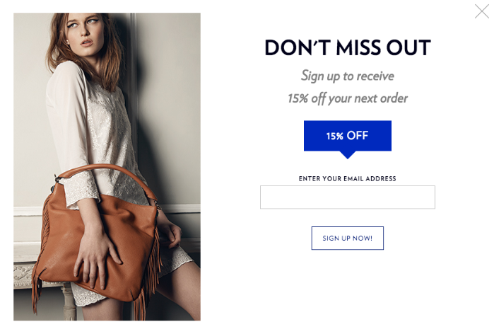
When you sell luxury handbags like Rebecca Minkoff, you already know that your clientele is very demanding and doesn't like to miss out on anything. However, it never hurts to highlight to your subscribers that the fear of missing out is genuine.
7. We care a lot
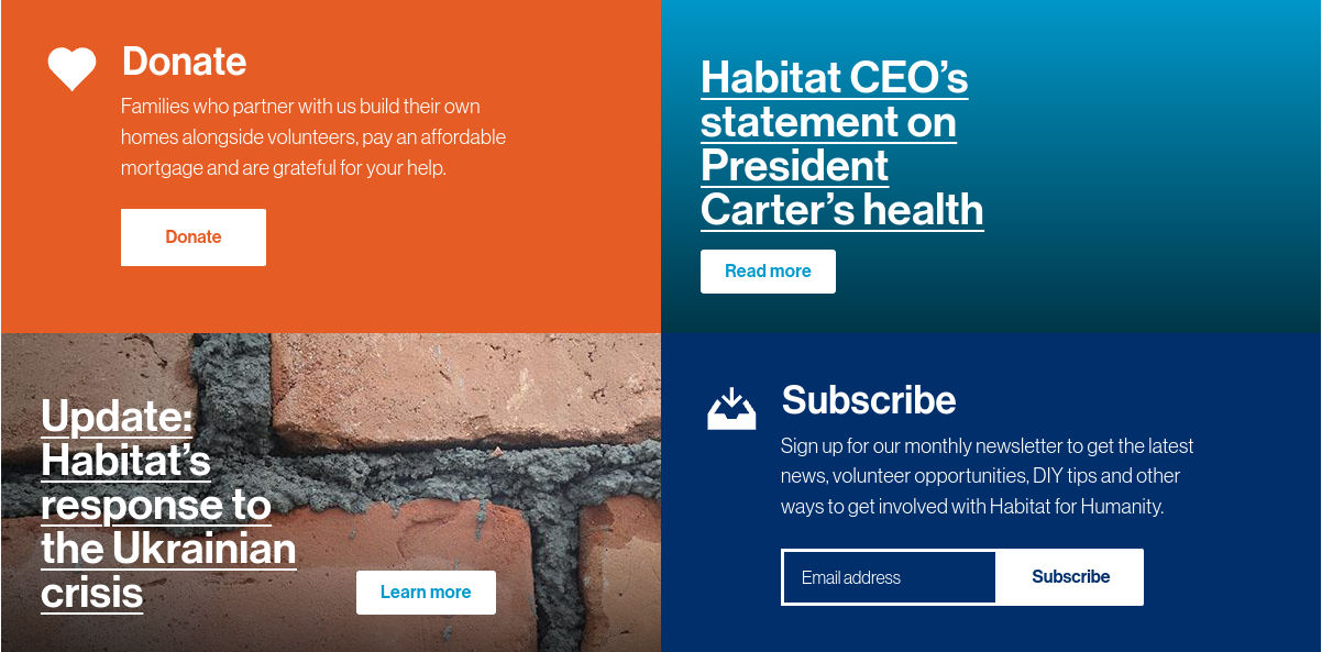
Email marketing is a potent mechanism for the charity and not-for-profit sectors. Despite this, too many organizations need to do a better job promoting their newsletters. They could learn a lot from Habitat for Humanity, which places its newsletter front and center with all its latest news and campaigns. Obviously, charities and non-profit organizations should prioritize fundraising, but an email subscription is the next best thing.
8. Share a passion, and get people talking
The publishing company Penguin knows that if their customers aren't reading a book, they are probably speaking about a book. Therefore, turning their email newsletter into a virtual book club with information about their latest titles, book recommendations, and author interviews makes perfect sense.

9. Sun, sea, sand, and email marketing inspiration
Who isn’t dreaming of a vacation? The budget airline Jet2.com knows that offering a little inspiration and some great deals by email gives people the travel bug. Plus it doesn’t hurt to have a prominent photo like this sunny vista to tip the scales in your favor.

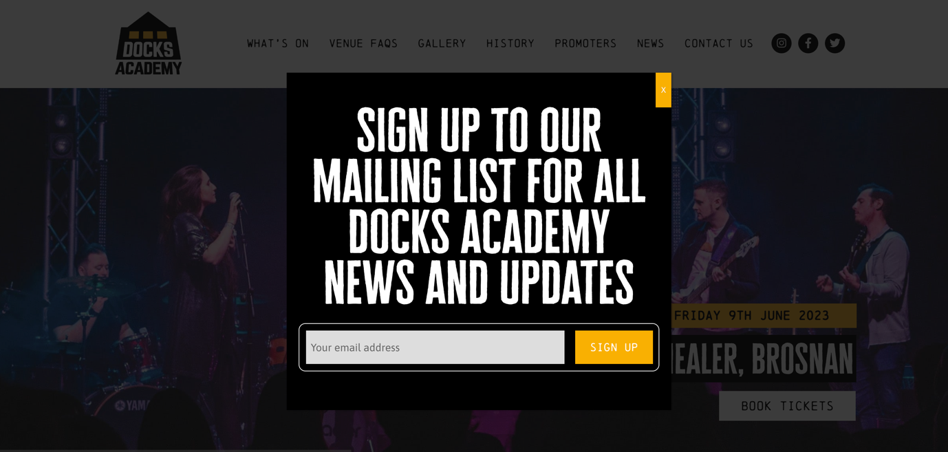
10. Fight for your subscribers' right to party
If a vacation isn't on the cards right now, how about a good night out instead? There is nothing worse than missing out on hot tickets for an event because you were late to the party. Your email subscribers are your most loyal customers, so why not give them a heads-up about your venue's latest events?
Boost sign ups with Mailjet’s Form Builder
The possibilities are endless when it comes to designing your signup form. The more care and attention you put into the design process, the higher the website conversions you’ll receive.
Mailjet’s Form Builder gives email marketers complete control over their email newsletter signup forms, with absolutely no design or coding skills required. Simply select the required layout and fields, enter your text, and upload your graphics. And Mailjet's Form Builder will generate the code for the signup form and take care of the workflow.
Form builder
Convert visitors with our subscription form builder
Create your subscription form using our drag-and-drop designer and grow your contact lists. Mailjet’s Form Builder offers a native double opt-in which guarantees your recipients' interest - an essential prerequisite for your reputation as a sender and GDPR.
